Things to consider before submitting your WP7 App
After countless hours of work you finally finished your amazing WP7 app. The first thing you think of now is getting the application out on the marketplace as soon as possible. Unfortunately many developers still waste the potential of their application by not taking time to carefully think about how users are going to find and use their application. Taking a little extra time to think about marketing will pay off in the end. The whole process of getting your app published is quite straightforward, but in this post I will cover some of the things I came across that you might want to consider. This is one out of a series of follow-up posts to my session at the Dutch DevDays.
Name & logo
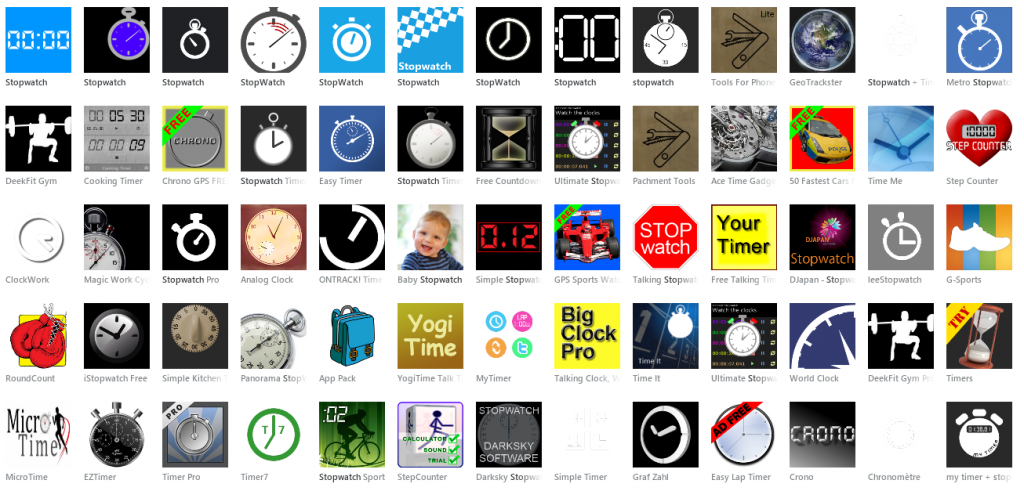
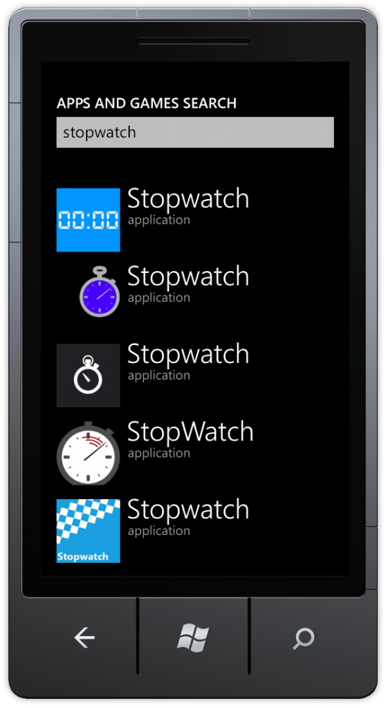
The first and most important to think about are naming the application and giving it a nice logo. Make sure you use the Zune software and your phone to check out the marketplace for similar applications. To understand why name and logo are this important, take a look at this example. Imagine you are a user looking for a simple stopwatch, you would enter “stopwatch” as a search query and would end up seeing this. Which app would you choose? Above you can see the results in Zune, below the results on the phone. So how does a user decide in this case? Of course this depends on the user, to get the best results make sure your name and logo style match the style of your application. If you made simple, functional, metro styled application, make sure the logo confirms to the Metro design guidelines. As can see in the above example the metro-styled logos appear to be the best looking. On the other hand if you made this outstanding app with awesome visuals, you might want to emphasize this in the logo. Category Something else you should consider is the category to put your application in. For most applications it will be quite trivial, a game goes in Games and news in News & Weather. But what about a stopwatch app we discussed in the example before. Many users will need a timer of some kind while sporting, so you will find a lot of stopwatch & timer apps in Sports. On the other hand a stopwatch can also be considered a tool and might get more attention in the Tools category. Just remember that choosing the right category might helpt your app to get noticed. This graph provided by wp7appexplorer.com shows the distribution of apps among the different categories. Their website provides some more interesting statistics.Description
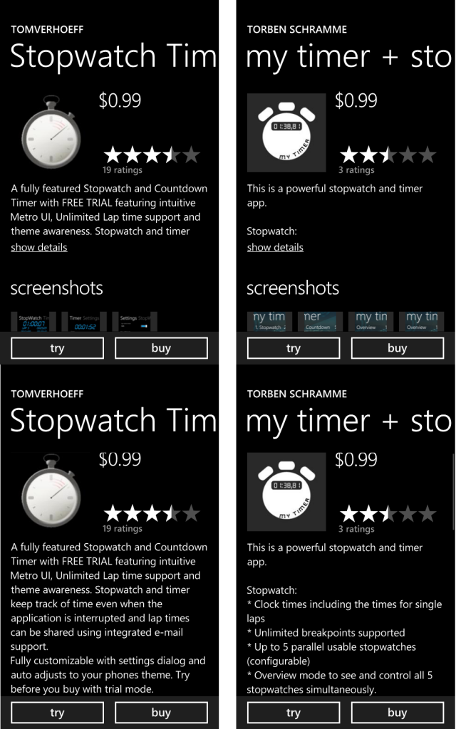
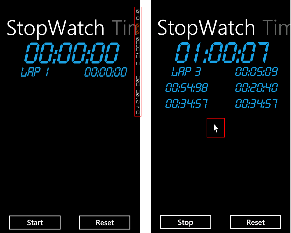
After selecting your application in the marketplace the description is one of the most important things a user will look at (apart from the rating). This is the moment a user decides whether or not your app will get a chance on his device, so make sure your message is convincing. Also remember that no single smartphone user will take the time to scroll through endless lines of description. Keep it short & clear. This is especially true on the phone, since only the first 4 lines of description will be shown on the initial screen. The user has to select “Show details” to make the rest of the description show up. The effect of not realizing this can be quite catastrophic. For example take a look at these stopwatch applications that basically do the same job. The right one is more feature rich, but a user won’t notice this out unless “Show details” is pressed. Only a fraction of users selecting your app will actually get to the point of “Show details”. Most users make their decision based on rating and the first 4 lines of description, so make sure you get them right. Unfortunately the App Hub does not provide any indication of what part of the description wil show up on the first screen. As a rule of thumb the first 4 lines will consist of approximatically 4 x 40 = 160 characters. Screenshots Screenshots are your last shot at convincing a user to download your app, so you better make sure it’s good. First of all make sure you don’t make any of these mistakes (they will probably fail your app for certifcation anyway). Do make screenshots that emphasize the unique features of your app. All important features should be visible on a screenshot! Also don’t forget to catch the app “in action”, so perform some actions before taking screenshots.Conclusion
These were some of the points I wanted to share with you. While working with WP7 the last 6 months I noticed that they CAN make a difference for every app. Bottom line is that taking a little extra time to think about marketing will make your app get the highest chance of success. Some other factors that will improve your app’s perormance in the marketplace are handling feedback to improve the ratings and marketing your app through networks like AdDuplex and monitor app usage with a tool like Preemptive Runtime Intelligencea. I will cover these in blogposts later this month.Tags: devdays, marketplace, wp7dev, wp7nl
Trackback from your site.


Comments (2)
Things to consider before submitting your WP7 App – www.nalli.net
| #
[…] Tom’s Blog After countless hours of work you finally finished your amazing WP7 app. The first thing you think […]
Reply
Making Money with Windows Phone applications at TechDays 2012 | Tom Verhoeff
| #
[…] Marketplace submissions/choosing the right name/logo/description […]
Reply